National Park Service: Freedom Trail Mobile App
- User Interviews
- | Contextual Inquiry
- | Affinity Mapping
- | Usability Testing
- | Sketch
- | Invision
TOOLS
Background & Project Brief
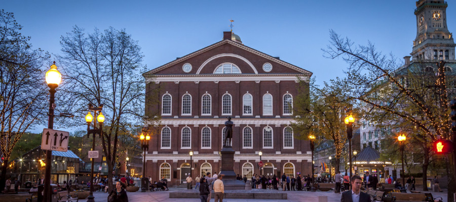
The Freedom Trail in Boston is a free walking tour anyone can take through Boston to see the history of the Boston & the birth of the United States. The Trail is 2.5 miles long, takes roughly 2 hours to walk, & is marked by a line of bricks in the sidewalk going from site to site.
This publice-space wonder is well-loved by Boston's residents & visitors for its access & ability to tie together the many historic sites in Boston. While visitors are generally unfamiliar with the exact route, residents have grown up walking the trail on school trips. Both groups need a way to create a trip for a group of people that they can then share to other group members.
Currently, the National Park Service provides a Freedom Trail application to help with this, but the experience of creating a tour for varying group sizes could be more useful & usable.
My Role
Research
Led the team in broadening out research scope to include more people.
Led the team in contextual inquiries which lead us to a wealth of information that helped us define our scope.
Led "guerrilla interviews" along the Freedom Trail
Design
I challenged the team elevate our designs by encouraging the group input from everyone.
Designed full user flows (including error messages) in Sketch.
Completed multiple usability tests, reported findings to the group, and iterated on designs.
Team Lead
Led the team in organizing daily deliverables through an Agile framework.
While the presentation of our design was a team effort, I presented the clickable prototype and answered most questions from the audience.
Led research strategy & execution, definition of scope, & presentation.
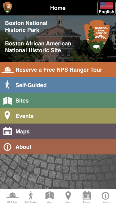
Solution
The new features we added to the National Park Service Freedom Trail mobile app allowed users to:
- Reserve tickets for a scheduled Park Ranger tour
- Schedule a private tour for groups over 10 people
- Create & Share their own tour
Users we tested our solution with described the experience as "very straight forward & easy to use."
"Oh, you want to see the details?
Great! Details are my favorite!"
Research
User Interviews
We quickly identified the ideal users we wanted to interview would be school trip coordinators & Boston Locals who are hosting visitors.
The time frame of this project made it difficult to schedule interviews with as many of these users as we would have liked. This led us to broaden our search by going directly to the Freedom Trail to interview people on the trail.
I conducted user interviews with:
- Teacher planning a trip to the Freedom Trail
- College Group Trip Coordinator
- Freedom Trail Tour Guide
While on the Freedom Trail we interviewed & observed:
- NPS Information Center Staff
- Museum Staff
- Tour Guides
- Boston Locals on a Tour
- Domestic & International Tourists


Comparative Analysis
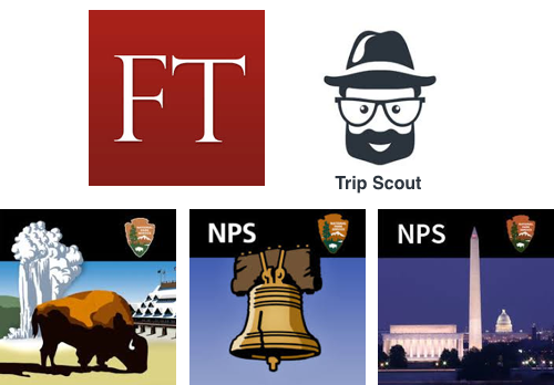
I evaluated direct & in-direct competitors, as well as the other National Park Service mobile apps for other National Parks.
By reviewing the Apple AppStore reviews, we found that people loved the simplicity of the Yosemite NPS App.
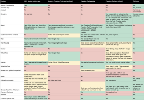
We took all of the analysis of these apps to learn what features are or are not present, which helped us identify what people expected from our new solution. We input this information into a color-coded spreadsheet to start the feature prioritization process.
Research Synthesis
In order to illuminate insights from our research, we synthesized our research observations in an affinity map using "Miro."
- "I want to know how to navigate the city."
- "I expect a certain amount of site information."
- "I have to consider attention spans in relation to tours."
Top 3 Insights:
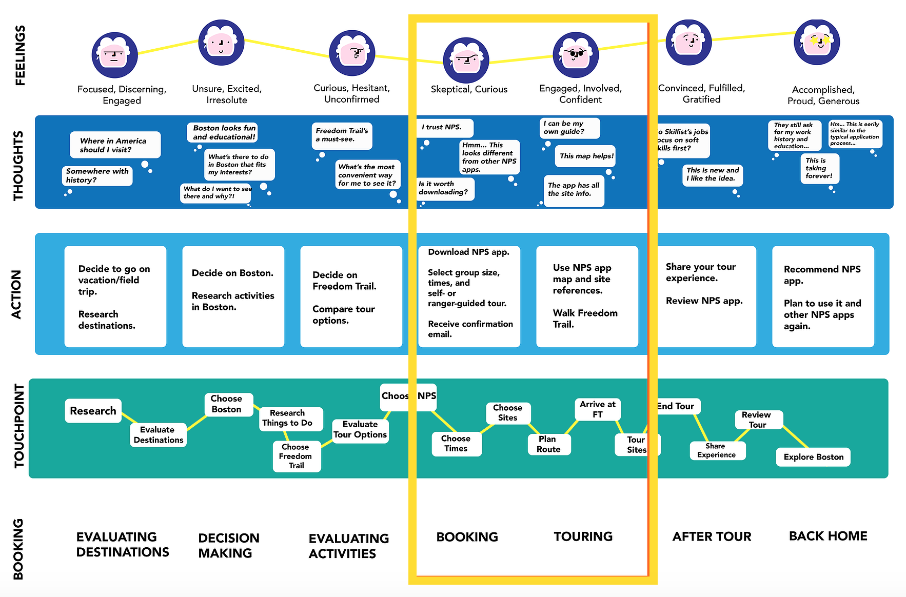
Customer Journey Map
Our research also led to understanding the full trip experience. We took this information & created a Customer Journey Map. The "yellow frame" denotes where our solution should focus on providing the most value.
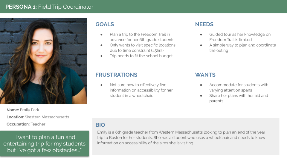
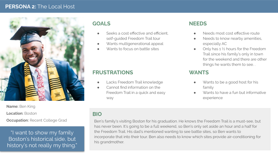
Personas
Our synthesis led us to create two personas that use the NPS Freedom Trail App.
Design Process
Design Workshop
I led a design workshop with the team that helped us ideate, find initial common ground, & help us know where we are heading as a team.
A Few Trends Emerged:
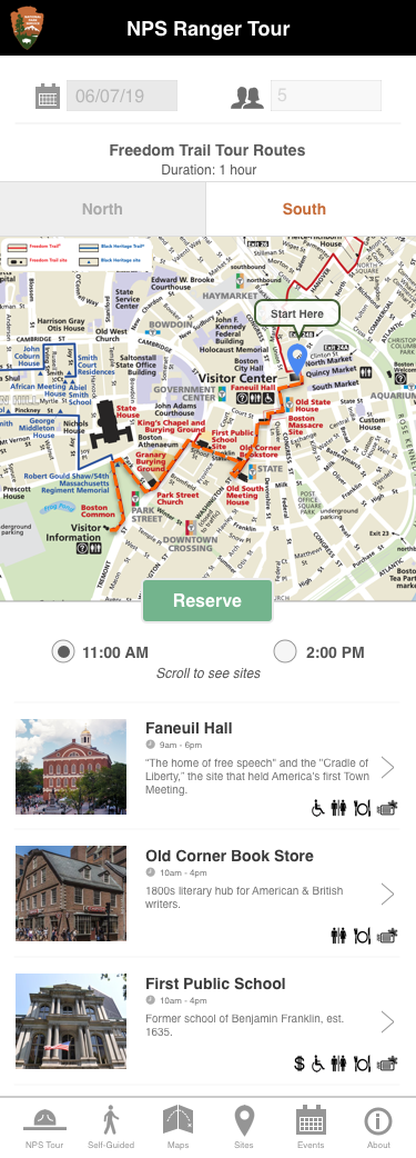
- Input Screen for Date & Group Size
- Displaying Available Tour Times
- Displaying Tour on a Map
One feature we discussed was a "virtual tour guide" that would be onscreen to provide directions & site information. This gave me the idea to create Augmented Reality experiences at the most historic sights. Ultimately, we decided both of these great ideas would be out of scope for this project.
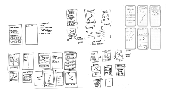
Paper Prototyping & Usability Tests
I led our usability tests with paper prototyping. Below are some notes on what users found unclear or confusing.
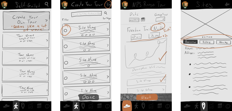
Design Hurdle
One challege was creating a screen that enabled the User to:
- Select a Route to Reserve
- Reserve Tickets for a Scheuled Tour
- See a Site List for the Selected Route
I ran a design thinking excercise where were all able to ideate, share, & ultimately collaborate on a solution that we were all excited about.
Some interesting design decisions on this page are:
- The South route is set as the default because we heard from NPS Rangers & Tour Guides that from Fanueil Hall South has the most to see within 1 hour.
- The times are reflective of the normally scheduled times of the NPS Ranger Guided Tours
- We worked really hard to create icons to display there information through icons. We wanted to show what sites had temperature control, as well as handicap access.
- Most users expressed planning their tour around where to eat before or after the tour. However, we found that the NPS could only suggest general areas to eat- not specific businesses. This is reflected in icon form on each site that is in an area users can find multiple food options.
Next Steps
Language Options
The NPS just recently added support for multiple language options at all of their sites. We discussed adding a flag option in the top right corner of the home screen for users to indicate their preferred language
Augmented Reality
During our research we heard that the biggest hurdle (especially for school trips) is increasing engagement while on the tour. While it was out of scope of this project, I strongly believe implementing AR at each of the sites would add dimension to learning while on the tour.
Example: While at the Old North Church, Paul Revere could be depicted explaining his quote “One if by land, Two if by Sea.”