Cambridge Used Bicycles: E-Commerce Wireframe
- User Interviews
- | Contextual Inquiry
- | Open & Closed Card Sorting
- | Information Architecture
- | Usability Testing
- | Axure
TOOLS
Store Background & Project Brief
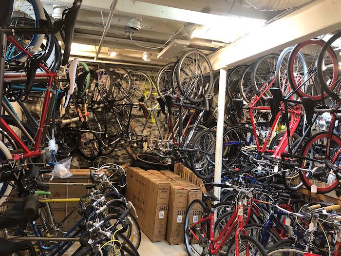
Cambridge Used Bicycles is a hidden gem of the cycling scene in Boston. It is hidden in the basement of an antiques shop & is run by two brothers who are known for their expertise in repairing all types of bicycles. While the shop is small, they service a very large college market as well as people who make their way through the antique shop & find them almost by accident.
Cambridge Used Bicycle customers need a way to purchase products from the store online because they currently only have the option of going into the store for their cycling parts & accessory needs. The business would also like to list all of their bicycle inventory as well as advertise & book the bicycle rental business.
Solution
My e-commerce solution shows:
- How customers organize bicycles, parts, & accessories
- How to book a rental/service Appointment
- Online Checkout Process
- What cyclists utilize bicycle shop websites for
"Oh, you want to see the details?
Great! Details are my favorite!"
Research Process
User Interviews
- Multiple visits to Cambridge Used Bicycles to interview the owners
- 1 Daily Commuter Cyclist
- 3 Triathlon Cyclists
Biggest takeaway from these interviews is that even novice cyclists will only browse bicycles online and then purchase in store in order to get the fit right. However, they are more apt to browse and purchase small parts/accessories online.
This caused a shift in focus in my website design I did not anticipate.
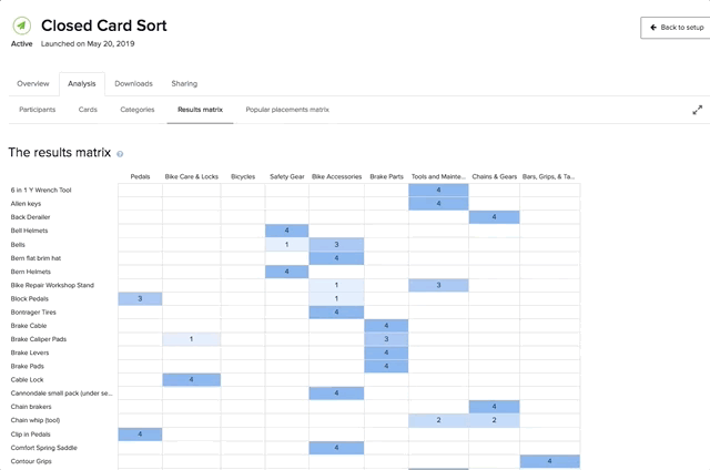
Card Sorting
I Conducted 6 Open Card Sorts which showed me users organized 100 bicycle products into 9 sub-categories.
I then took that information and conducted 4 closed card sorts to confirm my findings. With more time, I would have conducted another closed card sort in order to confirm categories for the 9 sub-categories I had confirmed.
Research Synthesis
Solution Statement
Cambridge Used Bicycles customers need a way to shop, browse, & book appointments online for all of their cycling needs & support a local business.
- Specifically:
- Browse bicycles online
- Purchase accessories online with in store pickup option
- Be able to book an appointment for service/rentals
- Find location/hours of the store
Hypothesis
We will know this to be true when online sales, in store sales (pickups), & rental/service appointments increase.
Design Process
Paper Sketches
I iterated multiple layouts/ideas for each page of the site on paper. I quickly learned that since cycling was a very visual & tactile experience, that creating a homepage that reflected that was key.
I also needed to keep in mind that most users browse for bicycles & when they go to a site it is to see what brands are carried by that store, as well as what accessories are available.

Usability Testing with Paper Prototypes
I am a huge proponent of usability testing with paper prototypes because it helps me get a baseline of if I am on the right track with freatures & layouts. It also shows me if I am missing anything with my design as well as helps me understand user's expectations better.
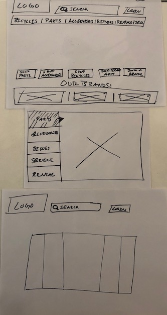
Iteration 1
Main Feedback:
- "Why is everything duplicated?"
- Navigation Elements were duplicated in Call to Actions.
- "Our Brands was confusing to some users."
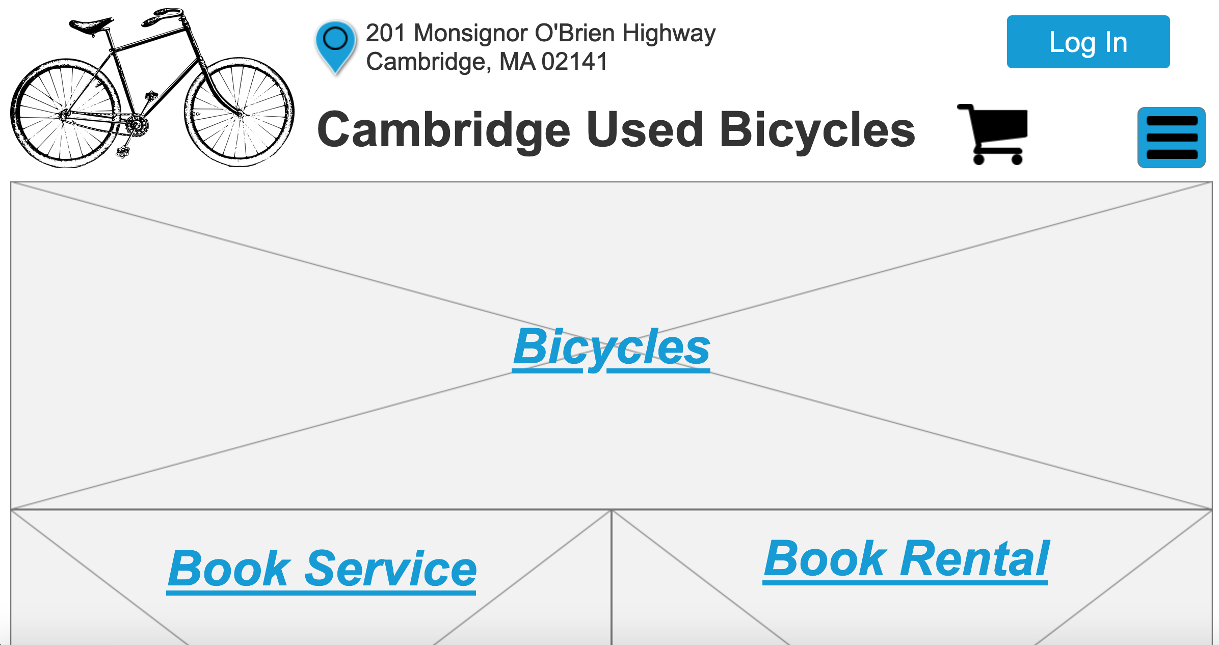
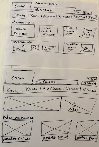
Iteration 2
Final Paperprototype:
- Moved main navigation into "Hamburger Menu"
- Bigger Photos for each section of the site
- Prioritized shopping/browsing options above the fold
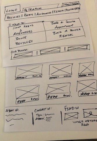
Takeaways from Usability Testing
- “Is a pedal an accessory or part?”
- Needed to make it clearer when an item had been added to the cart
- Need to add a “Problem Description” box in “Book Service Appt” Modol
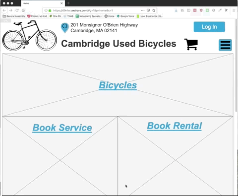
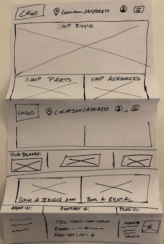
Clickable Axure Prototype
I took the information from paper protyping & usability tests to a clickable prototype in Axure.
Through this I learned how to keep my visual design elements at a bare minimum in order to evaluate key components and their placements.
I found through testing that users were able to point out details more easily than if the protoype was higher fidelity.
Next Steps
Part vs. Accessory | Mobile vs Desktop
I would like to research more on what makes something a part versus an accessory. User’s open and closed card sort put “clip in pedals” in accessory, but each usability test users tried looking for pedals under parts first.
As the fidelity of this site increases I would be interested in tracking success of the homepage both from desktop and mobile. My research in the field showed that a percentage of service appointments would come from mobile users who have just had a flat tire or need a chain fixed.